Tweet Timeline is a visual analytics tool for evaluating the impact of messages broadcasted through social media. In this version of the prototype, Twitter data is used. It visualizes different types of information associated with a single tweet, allowing you to see the retweet time pattern, the reach of the tweet, as well as the relationship between the users who re-tweeted. The summary pages (recent and all tweets) enable marketers/content providers to make better decisions on when to tweet a particular topic in order to maximize its impact. This concept can be extended to other social media: LinkedIn ("share"), Facebook ("like"), Google+ ("+1"), Pinterest ("repin"), Tumblr ("reblog"), etc.
This page displays all tweets posted in the past week (June 11-17, in this demo). Each dot represents a tweet made at particular day of week and time. The size of each circle denotes the number of retweets for the corresponding tweet. You can easily see and compare the performance of your recent tweets. Hover your mouse over a dot to see the tweet detail (text, number of RTs, and exact tweet time) and click it to see its timeline.
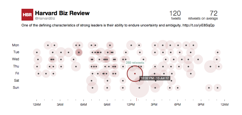
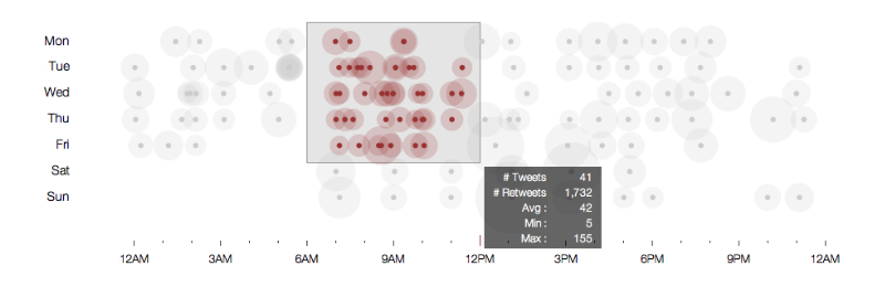
Ones might want to perform some simple exploratory data analysis on this page, for example, how does the number of retweets for tweets made during the weekday mornings compare to those made during the weekend mornings? You can simply drag your mouse to select a group of tweets to see the summary statistics.
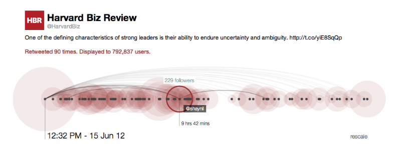
Tweet timeline connects different pieces of information associated with a tweet. Plotted on the horizontal time axis, each dot represents a retweet of the original message. This makes it possible to see the pattern of retweets. Next, the size of each circle is proportional to the number of followers the user who retweeted has. The reach of the tweet is then computed by summing up the numbers of followers, who are potentially exposed to the message. Lastly, an arc denotes a "follow" relationship between a pair of users. (More precisely, the user on the right end follows the other.) This is helpful for spotting users who do not follow the source or users who initiated subsequent retweets.
Hover your mouse over a circle to see the detail of the retweet (the user's screen name, the number of followers he/she has, and the time between the original tweet and the retweet) and click it to visit the user's Twitter page.
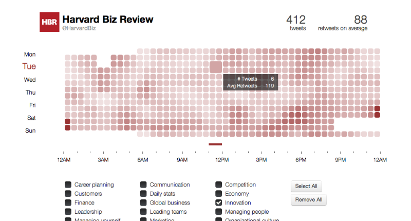
This page shows a heatmap of the average number of retweets based on time of day, day of the week, and topics. Move your mouse around to see additional information.
Q: Why the number of retweets shown on the timeline is different from the one on the recent tweets page?
Two reasons: (1) I can only retrieve up to 100 of the first retweets through Twitter API and (2) there are consistency issues with the API.
Q: How did you know the topic(s) of each tweet?
I followed the urls in the tweets, and in most cases, there are tags listed at the end of the article (example).
Q: What are the tools you use?
Python for getting data from Twitter API, processing data, and scraping websites. Twitter bootstrap, javascript and d3.js for the front end.
Q: This is awesome. Can I try it with my Twitter account?
I originally planned to make that possible, but with the Twitter's API rate limit, you would be able to explore only a few tweets per hour, and I do not want to give users bad experience. Note that a number of API requests have to be made in order to get the network information (i.e., user relationship in the timeline). However, if you are a developer, I'm more than happy to share my codes and let you try it yourself!
 HarvardBiz